Ich spiele seit meinem dritten Lebensjahr Geige, daher begleitet mich Musik
schon mein ganzes Leben lang. Allerdings habe ich beim Musikhören nie besonders
auf die Albumcover geachetet, bis mir klar wurde, dass die Typografie darauf
nicht einfach nur Buchstaben sind, sondern diese die Musik in visuelle Form übersetzt.
Viel Spaß beim Lesen!
Fun Fact über dich?
Viele Menschen hören klassische Musik beim Lernen. Couldn't be me!
Wenn ich klassische Musik höre, spiele ich gedanklich mit - besonders,
bei Stücken, die ich schon gespielt habe, was durchaus vorkommt.
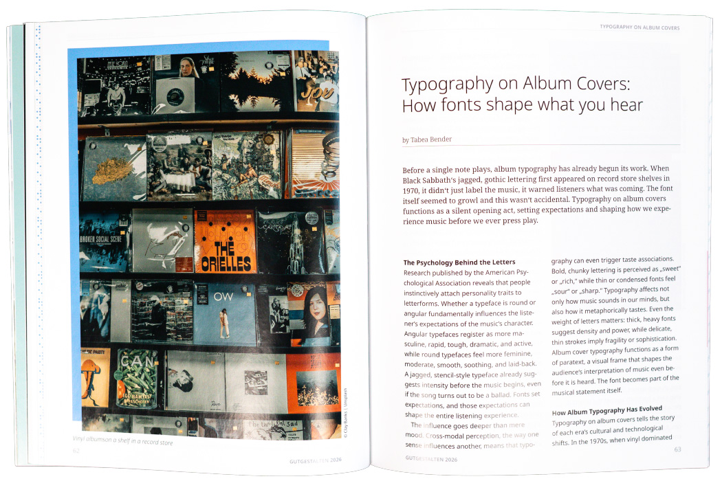
Before a single note plays, album typography has already begun its work. When Black Sabbath‘s jagged, gothic lettering first appeared on record store shelves in 1970, it didn‘t just label the music, it warned listeners what was coming. The font itself seemed to growl and this wasn‘t accidental. Typography on album covers functions as a silent opening act, setting expectations and shaping how we experience music before we ever press play.
Research published by the American Psychological Association reveals that people instinctively attach personality traits to letterforms. Whether a typeface is round or angular fundamentally influences the listener‘s expectations of the music‘s character. Angular typefaces register as more masculine, rapid, tough, dramatic, and active, while round typefaces feel more feminine, moderate, smooth, soothing, and laid-back. A jagged, stencil-style typeface already suggests intensity before the music begins, even if the song turns out to be a ballad.
Fonts set expectations, and those expectations can shape the entire listening experience. The influence goes deeper than mere mood. Cross-modal perception, the way one sense influences another, means that typography can even trigger taste associations. Bold, chunky lettering is perceived as „sweet“ or „rich,“ while thin or condensed fonts feel „sour“ or „sharp.“
Typography affects not only how music sounds in our minds, but also how it metaphorically tastes. Even the weight of letters matters: thick, heavy fonts suggest density and power, while delicate, thin strokes imply fragility or sophistication. Album cover typography functions as a form of paratext, a visual frame that shapes the audience‘s interpretation of music even before it is heard. The font becomes part of the musical statement itself.
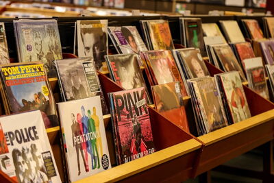
Typography on album covers tells the story of each era‘s cultural and technological shifts. In the 1970s, when vinyl dominated and album art served as the primary promotional tool, covers were text-heavy affairs. Groovy, psychedelic fonts with smooth curves listed entire tracklists alongside elaborate artist imagery. The typography was as much a part of the experience as the gatefold sleeve itself. Bands like Pink Floyd and Led Zeppelin created lettering that became inseparable from their visual identity.
The rise of MTV in the 1980s shifted the focus dramatically. As the artist‘s image became central to marketing, album covers evolved to feature large photographs of musicians, with text often confined to small, box-shaped spaces.
Interestingly, this era also saw a backlash against the previous decade‘s rounded fonts, resulting in a spike in the use of sharp, angular serif typefaces. Artists like Duran Duran and Madonna employed bold, geometric typography that reflected the decade‘s emphasis on glamour and excess.
The 1990s brought the internet and digital technology into mainstream consciousness, and album typography reflected this shift. Geometric, computer-inspired typefaces reminiscent of early video games and instant messaging became popular. TLC‘s „FanMail“ album exemplified this trend with its pixelated, digital aesthetic. The fonts looked like they belonged on a computer screen, mirroring the era‘s fascination with technology.
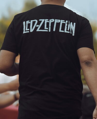
Then came a surprising reversal. Despite continued technological advancement, the late 2010s saw handwritten fonts exceed all other types to become the most popular choice. The year 2019 marked both the peak of handwritten typography and the highest number of album covers with no text at all.
This trend reflected a cultural push for authenticity and intimacy in an age of curated social media personas. Handwriting felt more personal and genuine in contrast to the polished perfection everywhere else. Today‘s album covers experiment with integrating typography directly into the artwork itself, blurring the line between text and image. Ariana Grande‘s „Thank U, Next“ features the title tattooed on her chest, making the typography literally part of her body. Post Malone‘s „Beerbongs & Bentleys“ shows the abbreviated title „b&b“ superimposed on a yellow CD case, treating the text as both label and artistic element.
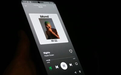
Album art has evolved from simply identifying music to serving as a complementary piece of visual art, especially crucial in the streaming era, where a thumbnail must capture attention in a fraction of a second.
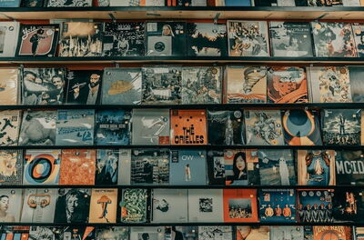
Blackletter and gothic typefaces have become synonymous with metal and hard rock, and the connection runs deeper than simple association. These fonts, with their historical roots in religious manuscripts and medieval lettering, carry visual sharpness, heavy contrast, and dense, compact structures. Their pointed serifs, fractured symmetry, and blade-like edges visually imitate the intensity of distorted guitars and aggressive vocals. The thick vertical strokes resemble the crushing weight of guitar riffs, while the sharp terminals feel as abrasive as screamed vocals or rapid double-bass drumming.
Bands like Iron Maiden and Metallica have consistently used blackletter lettering across decades of releases, cementing these fonts as cultural code for loudness, danger, and rebellion. Even before someone hears the music, the typography prepares the ear for something intense, dramatic, and possibly aggressive. The font becomes a warning label and an invitation simultaneously.
Approachability in Every Curve
Pop music moves in the opposite direction, favoring rounded sans-serifs, soft scripts, and bubble-like typography. These fonts don‘t threaten or provoke, they welcome. The letterforms offer a sense of friendliness and approachability that mirrors the melodic accessibility of most pop tracks. When artists like Taylor Swift or Ariana Grande use geometric sans-serifs such as Futura or Avenir, or employ handwritten scripts that look glossy and polished, the typography signals that the listening experience will be easy to digest and possibly uplifting. According to font psychology research, letterforms with few sharp angles tend to be perceived as warm, safe, and emotionally positive. Pop typography rarely surprises, it reassures. The fonts promise pleasure without challenge, accessibility without pretension.
Authority Through Weight
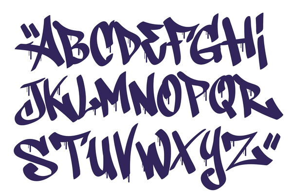
Hip-hop relies on bold, assertive visual strategies. Many covers feature block-like lettering that resembles urban signage, stencil fonts that recall street-level graphics, or graffiti-inspired scripts that introduce motion and attitude. These fonts appear heavy and direct, reflecting the confidence commonly associated with rap vocals and lyrics. Even without images, the weight and scale of the typography conveys authority. The listener isn‘t invited softly, they’re confronted with a visual statement that demands attention. Artists like Run-DMC established the power of bold, all-caps lettering, while more recent acts continue to experiment with typography that feels tactile and territorial, as if claiming space on the page the way lyrics claim space in culture.
Indie and lo-fi albums embrace handwriting, typewriter fonts, and intentionally imperfect spacing. Jagged baselines, uneven weights, and inconsistent letter sizes aren‘t flaws, they’re features. These visual irregularities represent authenticity and vulnerability, framing the music as intimate and unpolished in the best possible way. Bon Iver, Sufjan Stevens, and countless bedroom pop artists use typography that looks homemade, as if the album title was scrawled in a notebook moments before recording. The fonts whisper rather than shout, suggesting that what follows will be personal, maybe fragile, and definitely human.
The Precision of Emptiness
Electronic and experimental artists typically favor minimal typography with thin lines, wide spacing, and controlled emptiness. Monospaced fonts or very light sans-serif typefaces are common because they mimic digital structure and technological precision. These fonts behave almost like silence on the page. They don‘t fill the space but rather hover within it, creating a visual equivalent of synthetic soundscapes or long reverb tails. Artists like Daft Punk, Kraftwerk, and Aphex Twin use typography that doesn‘t announce itself loudly. Instead, it suggests clarity, futurism, and emotional distance. The clean lines and geometric precision feel machine-made, perfectly suited to music that often is.
When artists choose fonts that contradict their genre‘s established codes, the effect is rarely neutral. A metal band using soft serif text or a pop singer choosing harsh angular typefaces immediately creates friction between expectation and presentation. If used intentionally, this mismatch can generate curiosity and signal experimentation. The listener understands that the music might contain surprises or contradictions. Radiohead‘s use of modified Helvetica and distressed typography across albums like „Kid A“ signaled their departure from conventional rock. The dissonance between their earlier guitar-driven sound and their later electronic experiments was visible in the fonts before it was audible in the music. Typography in this context becomes strategic disruption rather than direct translation.
The Final Note
In an era where most music is consumed through streaming thumbnails barely larger than a postage stamp, typography has become even more crucial. The font must work harder, communicate faster, and remain legible at impossibly small sizes. Yet its fundamental purpose hasn‘t changed since those 1970s vinyl days: to prepare the listener, to set the tone, to promise an experience. Typography on album covers proves that fonts don‘t simply decorate sound but they participate in its framing, setting the mental volume of the music long before the real one begins. Before the first chord strikes, before the beat drops, before the vocals enter, the letters have already started singing. ■
Wir verwenden Cookies und ähnliche Technologien, um Ihre Erfahrung auf unserer Website zu verbessern. Einige Cookies sind für die grundlegende Funktionalität erforderlich, während andere dazu beitragen, die Nutzung zu analysieren und unsere Dienste zu optimieren. Detaillierte Informationen finden Sie in unserer Datenschutzerklärung.
Diese Cookies sind für den Betrieb der Website notwendig. Sie speichern beispielsweise Ihre Datenschutzeinstellungen, gewährleisten die Sicherheit der Website und ermöglichen grundlegende Funktionen. Ohne diese Cookies kann die Website nicht ordnungsgemäß genutzt werden.
Externe Medien
Wenn Sie dieser Kategorie zustimmen, können Inhalte von Drittanbietern geladen werden, beispielsweise Videos von YouTube oder Karten von Google Maps bzw. OpenStreetMap. Dabei können personenbezogene Daten wie Ihre IP-Adresse an die jeweiligen Anbieter übermittelt werden.
Statistik
Diese Cookies helfen uns zu verstehen, wie Besucher unsere Website nutzen. Die Daten werden anonymisiert oder pseudonymisiert ausgewertet, um Inhalte und Benutzerfreundlichkeit zu verbessern. Hierfür können Analysewerkzeuge wie Google Analytics oder Matomo eingesetzt werden.
Sie können Ihre Auswahl jederzeit über die Datenschutzeinstellungen ändern oder widerrufen.